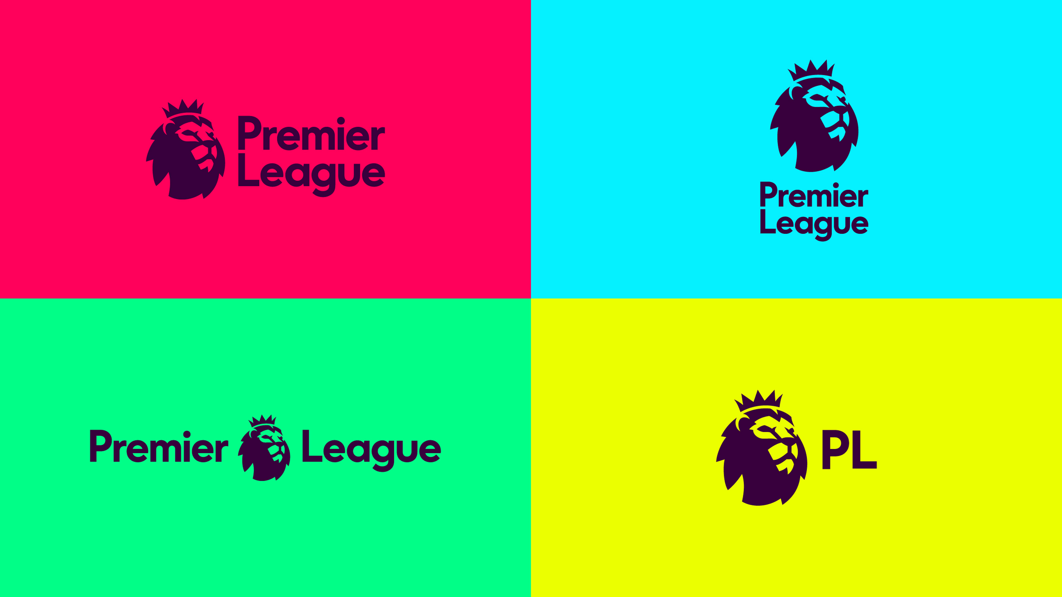
The last fifteen years have seen a substantial increase in the importance of logos amongst consumers. Logos are playing a more important role than ever in defining companies public appearances.
Keeping up with the design trends of the modern world, logos are becoming a minimalistic and simple branding accessory. Logos have become so influential in our world, US presidential candidates now use them for their running campaigns. This was first exploited in the Obama campaign where he used the "o" shaped logo to represent a "new dawn" in America while also simulating the US flag. The "o" was used as a tangible symbol in the voter's minds when entering the booth on election day.

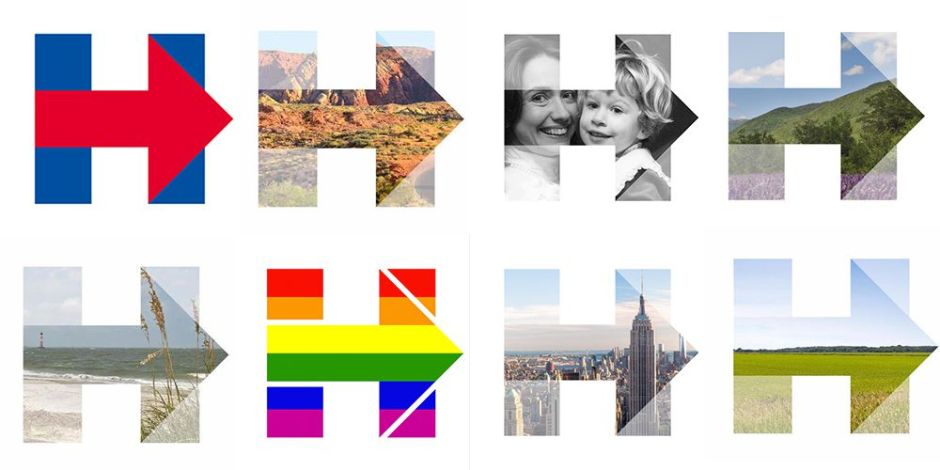
This year both Clinton and Trump used logos through their campaign. Clintons was by far the most effective symbol. The design was "intentionally simple" using only 2 primary colours and a symbolic arrow pointing the direction of America's future.
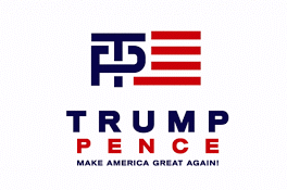
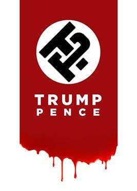
Trump's logo, on the other hand, was dropped by the campaign because of the extremely poor reception it received and online mockery. The "TP" bared too much of phallic and swastika resemblance, surely someone should have seen this coming?
I feel like the key to redesigning logos is retaining a strong sense of familiarity. The "minimal" logo style has become so popular as it allows for consistent branding across physical and digital platforms.
Often when rebranding, companies fall into the "modernist trap" of trying to be "designer cool". The Gap logo redesign is the perfect example of this. They completely lost all heritage links by attempting to use the Helvetica typeface where it was more than unnecessary.

Juventus F.C. are one of the first big-time football clubs to adopt the new minimalist logo styling. As sleek as their new stripped "J" emblem is, I think it moves too far away from the history of the club. Without "Juventus" spelt across the top of this new design, would you recognise the club from the logo?
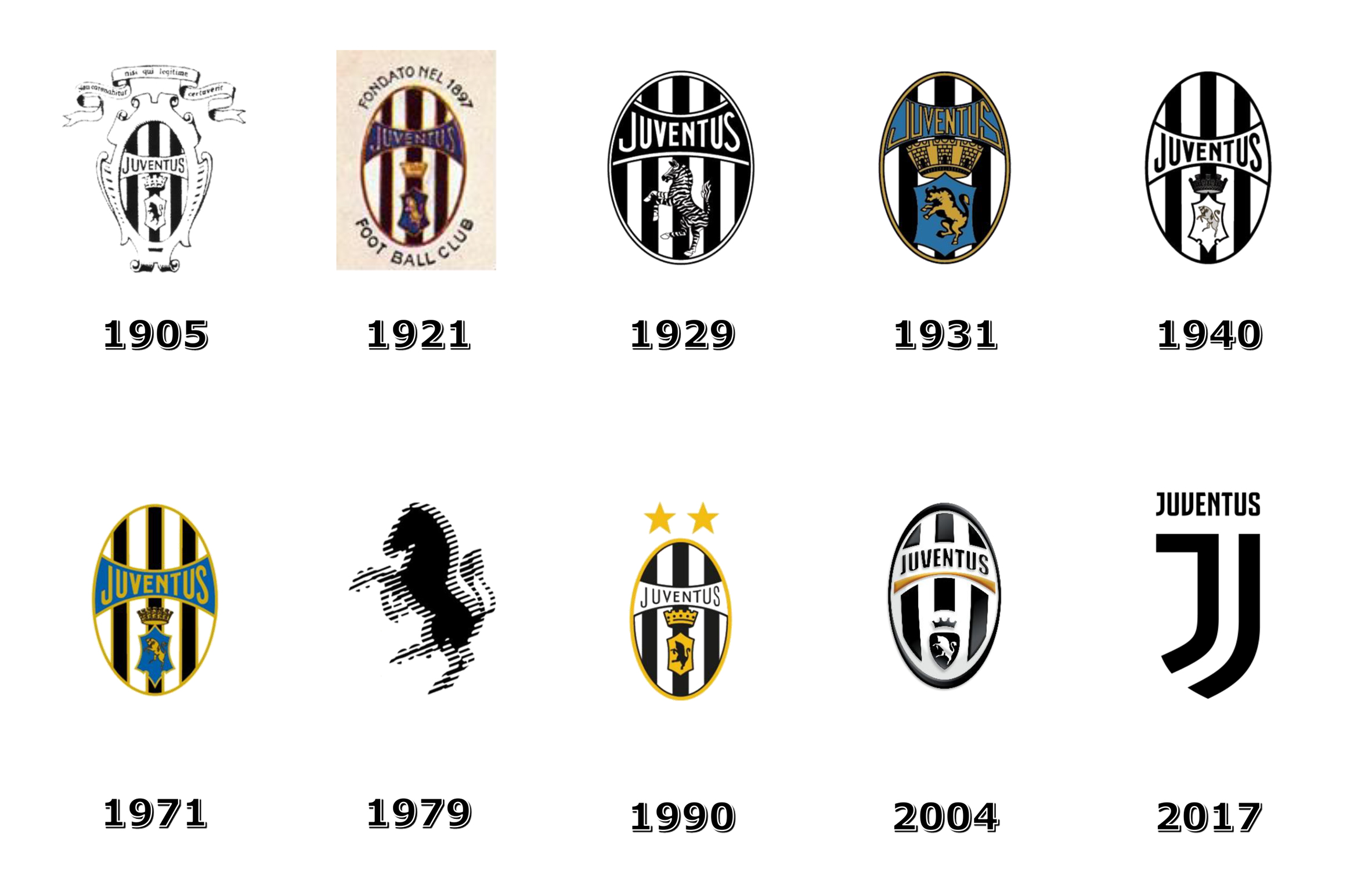
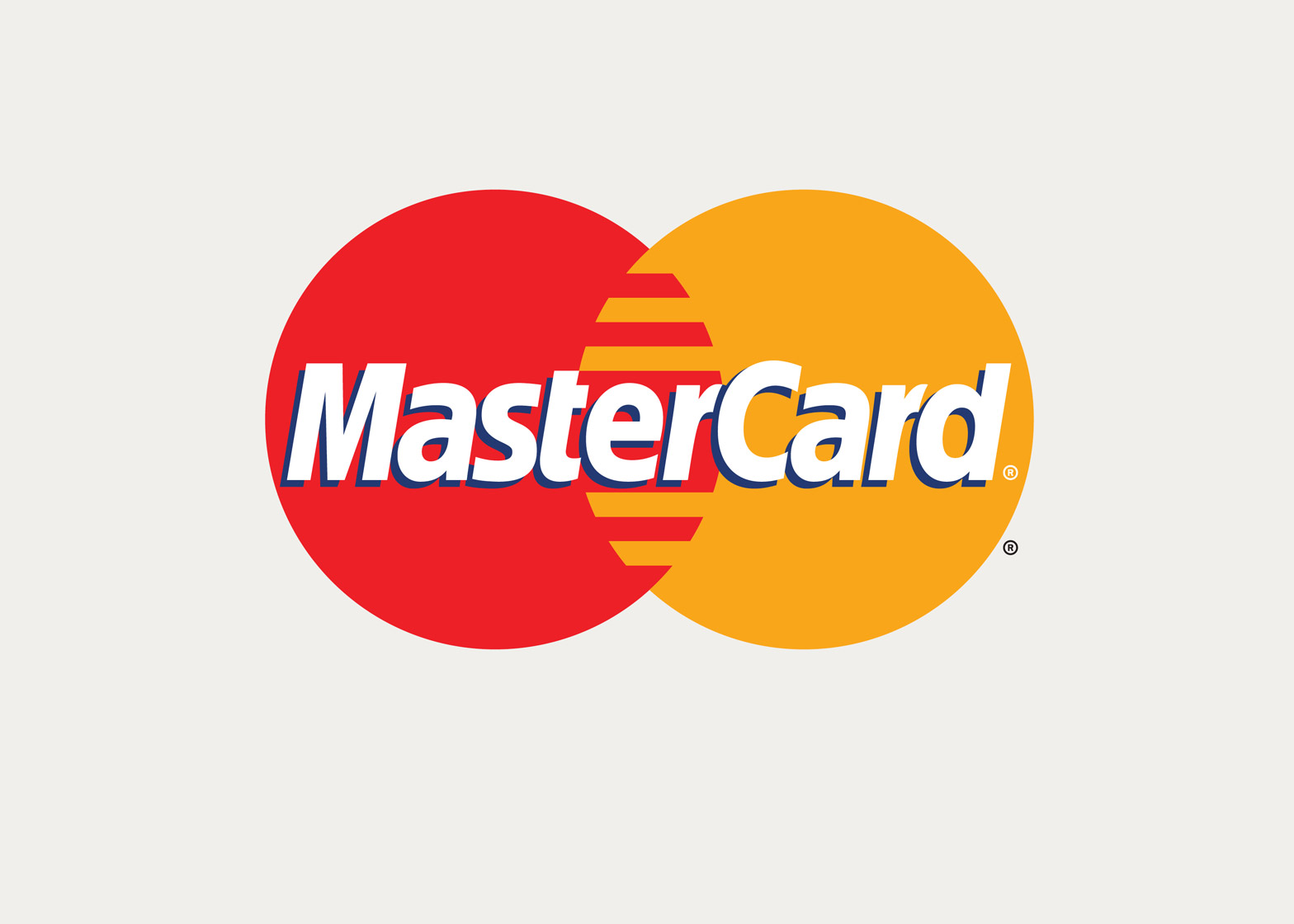
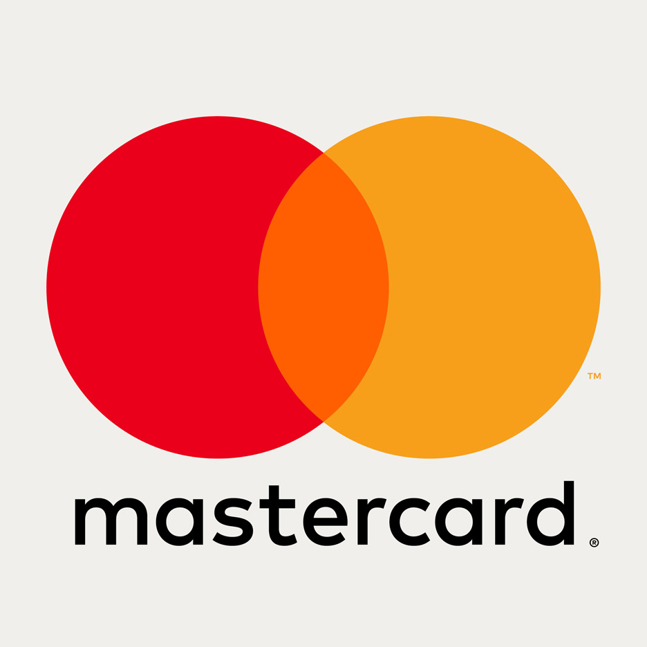
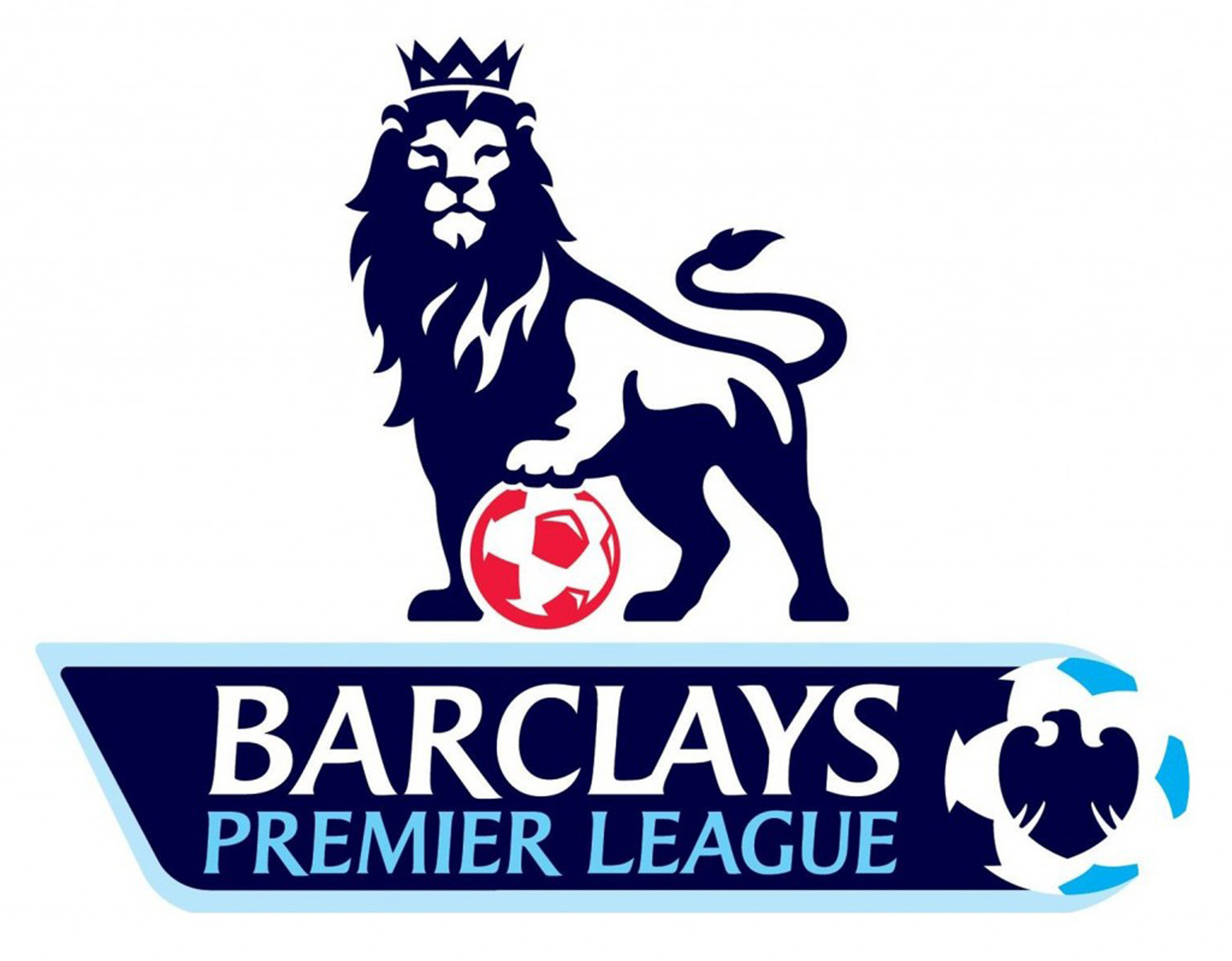
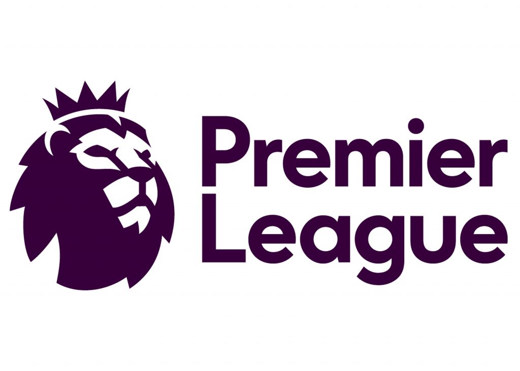
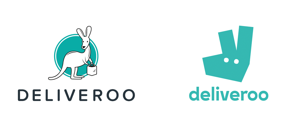
The best logos are the simple yet effective. If you were to test people's memory by asking them to draw the new vs old logos below, which do you think they'll find easier to remember?

Adding an extra layer of satisfaction to the logo is always a plus. By this, I mean making the logo a clever representation of the brand in a subtle way. Have you ever seen the arrow in the FedEx logo? If you're struggling I left you the answer below the image.
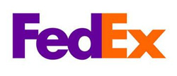
(it's between the "E" and "x" )
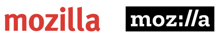
Mozilla have also created this extra satisfaction in a more intuitive way. The '...ill..." in their new logo replicates the "://" found in the address bar on the browser.
Of course, not all of these new generation logos are great design. In 2012 the London Olympics pulled a shocker by using this abstract collage of meaningless shapes to represent the greatest sporting event in the world!
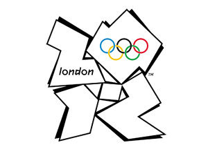
But maybe on some level, the meaninglessness behind the logo is what makes it suited to the Olympics? London 2012 shouldn't be remembered for its logo, but for the sporting greatness that was achieved throughout the Olympics. The logo is simply a piece of graphic design that will be remembered as an accompaniment to the sporting achievements of all the competitors in London 2012. I still think the logo is aesthetically horrific, but maybe it doesn't matter so much in this instance.
My idea of great logo design:
Stay true to the brand/product/company
Font matters! - choose wisely!
Keep it simpleTry to incorporate some subtle meaning
Avoid the pointless