This week for Glasgow School of Art we were challenged to ask ourselves “what is great design?” We were told to find two objects that represent great design and explain why.
Krastor Pencil Sharpener by Rodrigo Torres for Allessi - 2013
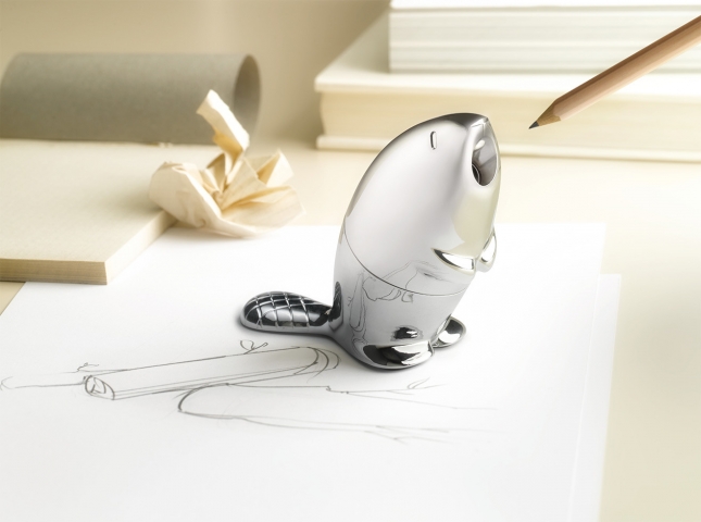
Krastor, from the Greek meaning “to excel or shine”, is a perfect name for this elegant little sharpener.
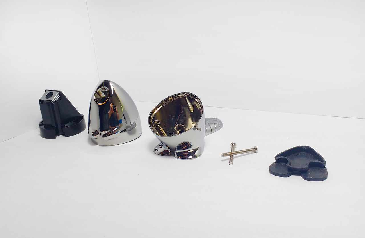
The product is manufactured from 6 separate components:
- 2 separate chrome plated zamak outer housings
- An injection moulded plastic internal structure
- A classic style pencil sharpener
- A silicon base
- 2 assembly screws
Eyes, teeth, paws and a tail define the overall form of an animated beaver. Using the sharpener shows a great sense of humour from the designer as you place the pencil in the beaver's mouth. These quirky features almost give the beaver its own personality.
The product is operated like any other sharpener. On a practical level, Krastor does a great job of sharpening pencils, collecting all shavings internally. The silicon base can be removed to empty shavings when necessary.
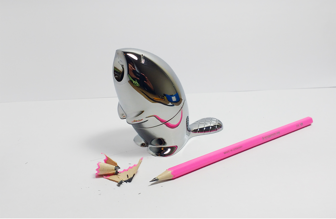
The reflective chrome finish is very eye-catching and creates an intriguing, distorted image of other desk items. Most pencil sharpeners are used on the rare occasion of a blunt nib. The amount of time that sharpeners are in use compared to being left idol is minuscule. Therefore, Krastor’s main function is to be a beautiful desk ornament, and when needed, an easily accessible pencil sharpener. No more rummaging around in pencil cases and drawers looking for a tiny sharpener. The weight of the product also allows it to be used as a paperweight.
I believe the main factors that make this product great design are found in its elegant chrome plated biomorphic form combined with ease of access and overall functionality as a pencil sharpener.
BN0021 Watch by Braun - 2004
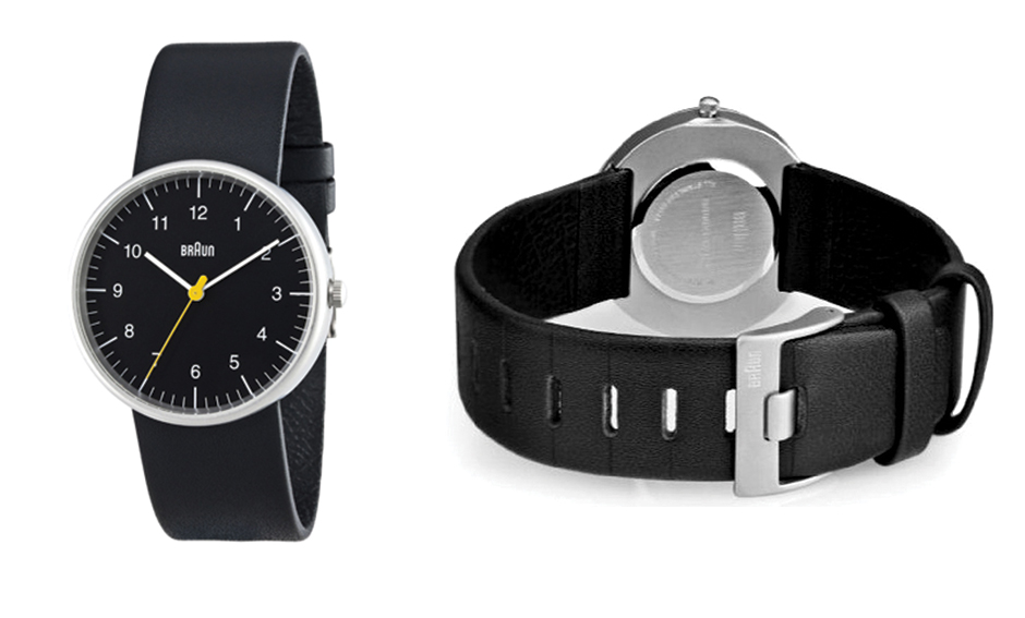
Although this watch is not what you would call an original Braun product from the "golden years", the overall form and design ethos has been reflected in this new product.
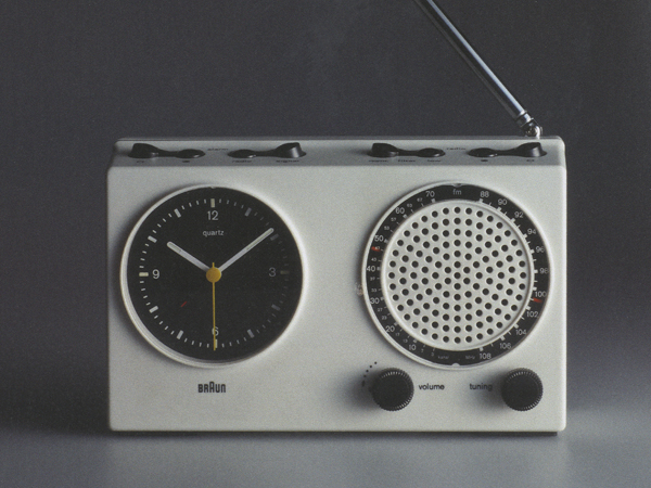
The iconic Braun clock face, first designed in 1978 by Dieter Rams & Dietrich Lubs for the ABR 21 clock radio, lives on in this new design. Without branding on this watch it is still easily identifiable as Braun, down to the high contrasting yellow and white hands on a black face. The clock face itself is very easy to read and only has one control knob to adjust the time. Simplicity in design makes great design.
“Less, but better” has been a design ethos for Dieter Rams during his reign as Chief Design Officer at Braun and it seems to reflect in the design of this product. The form is very minimal with the strap hooks hidden under the clock face. The choice of materials gives the watch a sense of industry and class, yet wearable for almost any occasion. My watch has been worn on a daily basis over the last year, tarnishing and damaging some of the leather. I feel like this just adds more character and personalises the product as you grown more attached. Overall the watch is a very desirable item, especially for people with knowledge of Braun’s history. To me, this watch represents a strong foundation for modern day design that is respectful of the Braun history.
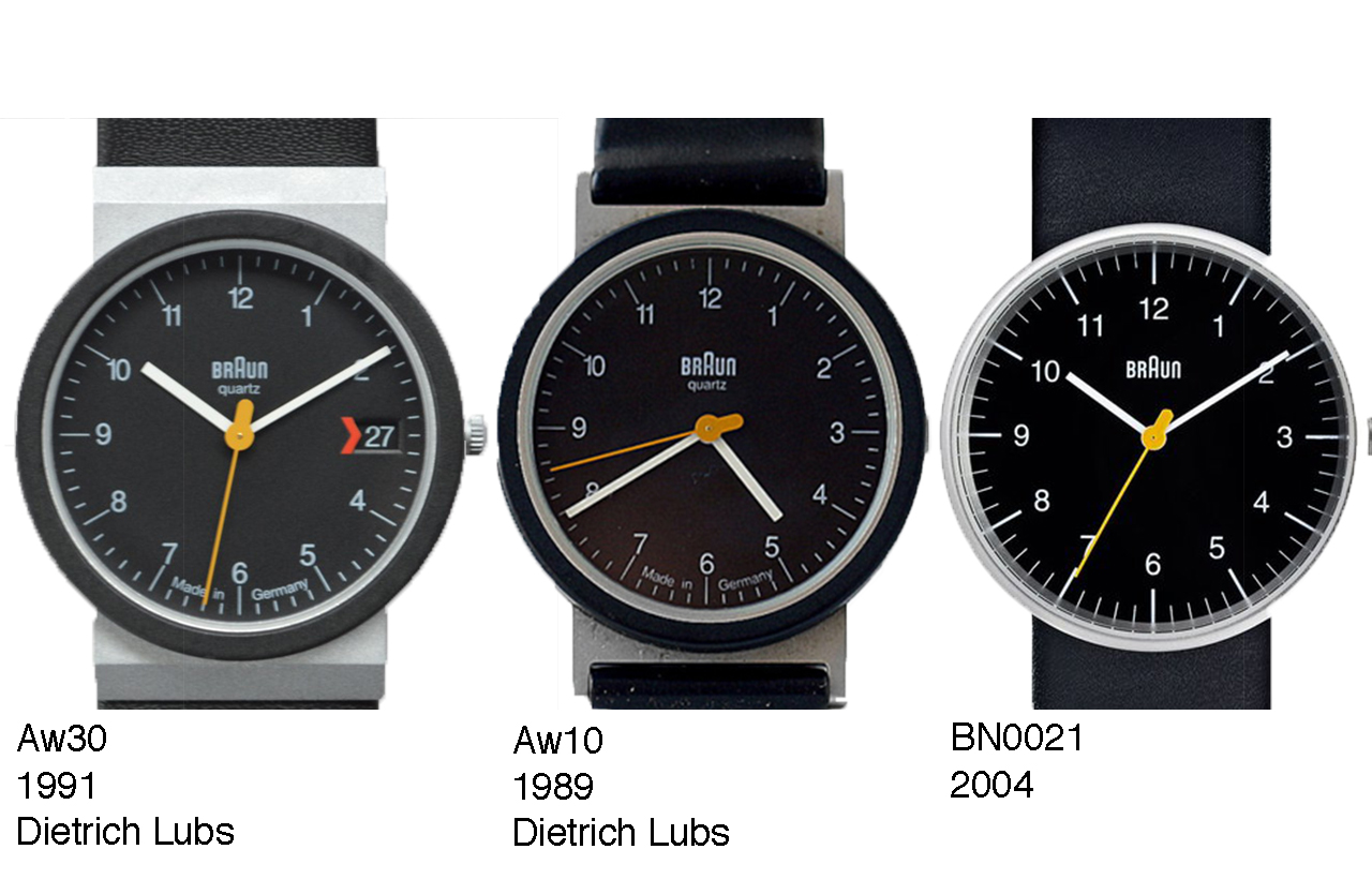
However, I do have some critics on the execution of the product. Originally Braun watches were manufactured to a high standard in Germany. This watch is manufactured in China which degrades the name of Braun to a certain extent. The watch is still charged at a premium price but fails to deliver the highest quality of material and manufacturing process.
In saying this I still have a very strong attachment to this watch and believe the overall design of the watch face and components are great design, even if the build quality is lacking.